Will This Fit In My Car
Will This Fit In My Car is a concept tool to visualize IKEA furniture fitting into vehicle cargo space. Designed and prototyped in Figma and HTML/JS. Currently exploring feasibility for dimension matching, with future options like social-sourced data or stack logic.
Project Overview
Solo concept and execution — product strategy, UI design, and early front-end prototyping
Will This Fit In My Car?
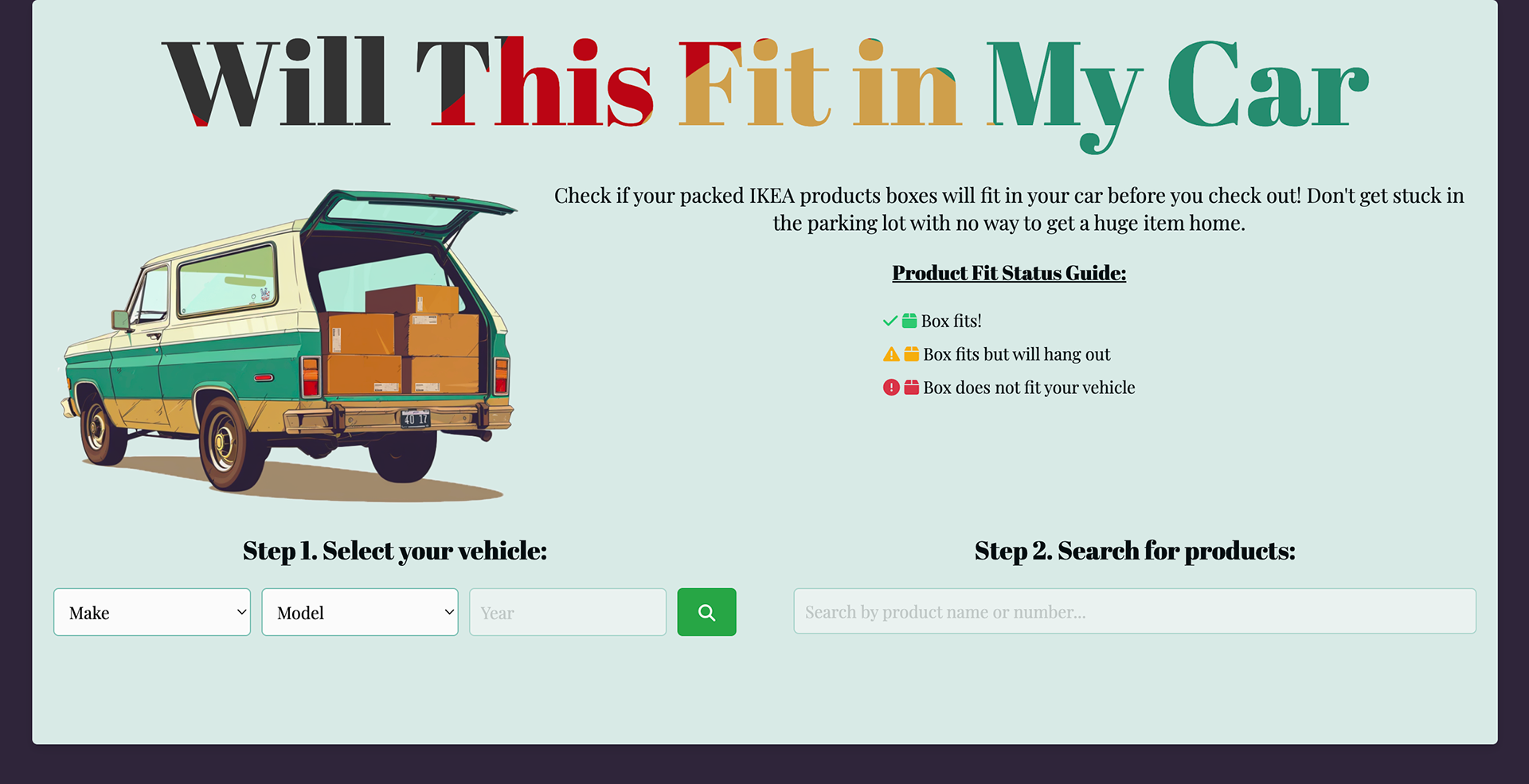
A concept tool to visualize whether IKEA furniture will fit in your car’s cargo space — using dimension overlays, brutalist UI, and potentially social-sourced data.
A personal side project inspired by the mismatch between online specs and real-world transport.
A concept tool to visualize whether IKEA furniture will fit in your car’s cargo space — using dimension overlays, brutalist UI, and potentially social-sourced data.
A personal side project inspired by the mismatch between online specs and real-world transport.
Role: Solo Designer + Developer
Platform: Web (HTML/JS prototype)
Tools: Figma, JavaScript, GitHub
Status: In exploration (paused to assess data + feasibility)
Goal: Explore intuitive ways to match product dimensions to vehicle cargo space, with future potential for crowdsourced or algorithmic fit validation
Platform: Web (HTML/JS prototype)
Tools: Figma, JavaScript, GitHub
Status: In exploration (paused to assess data + feasibility)
Goal: Explore intuitive ways to match product dimensions to vehicle cargo space, with future potential for crowdsourced or algorithmic fit validation
Problem Space
Online furniture stores make it easy to buy big items — but not to get them home.
Specs are numeric, cargo space is abstract, and most people guess.
Specs are numeric, cargo space is abstract, and most people guess.
I set out to explore a tool that could answer, “Will this fit in my car?” A simple question… that’s surprisingly hard to solve. I wanted to create a system where:
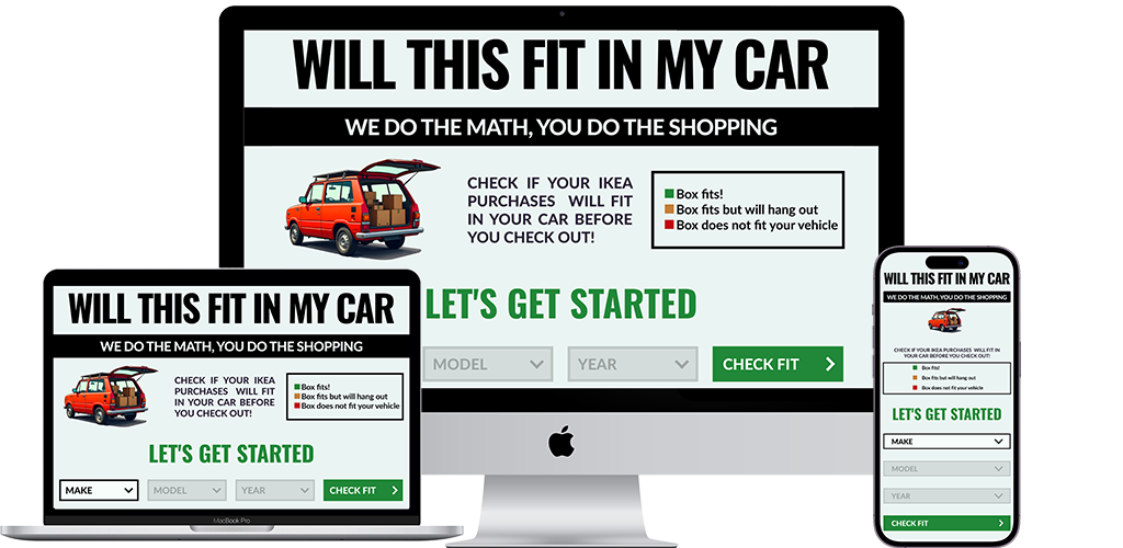
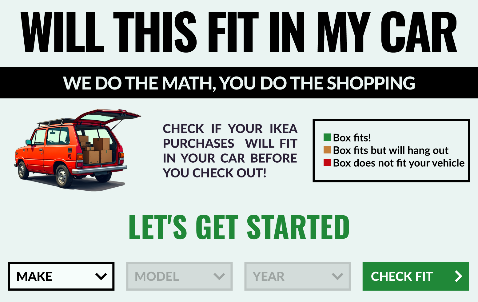
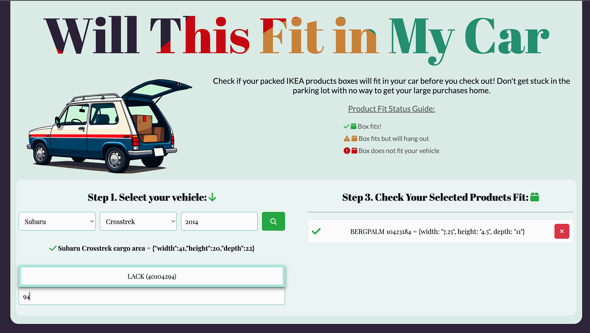
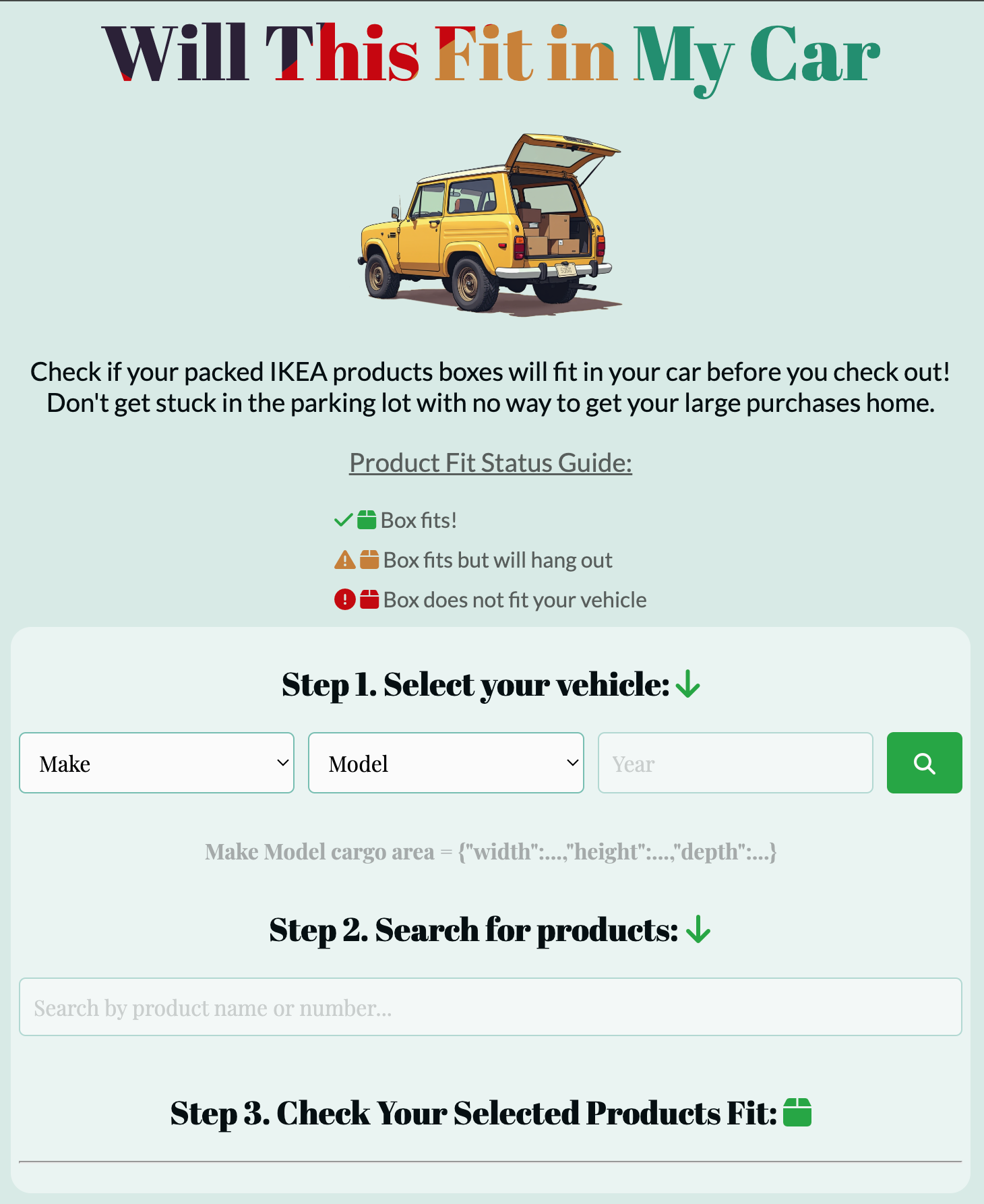
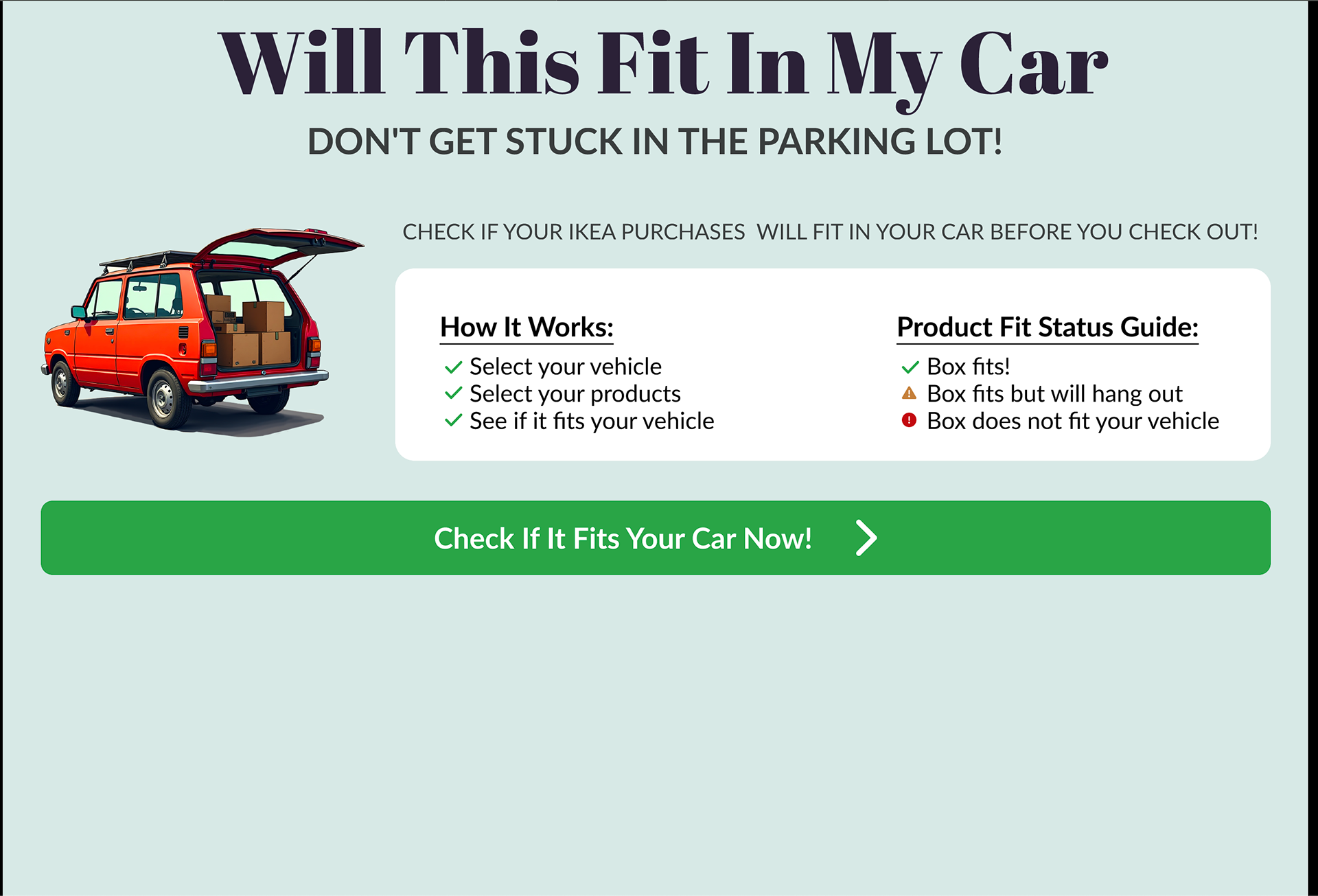
• Users select their car make/model to auto-load cargo space dimensions
• Furniture is added by searching name or product number, dimensions auto-fill from known items
• Each item is virtually placed into the vehicle layout, gradually filling the space
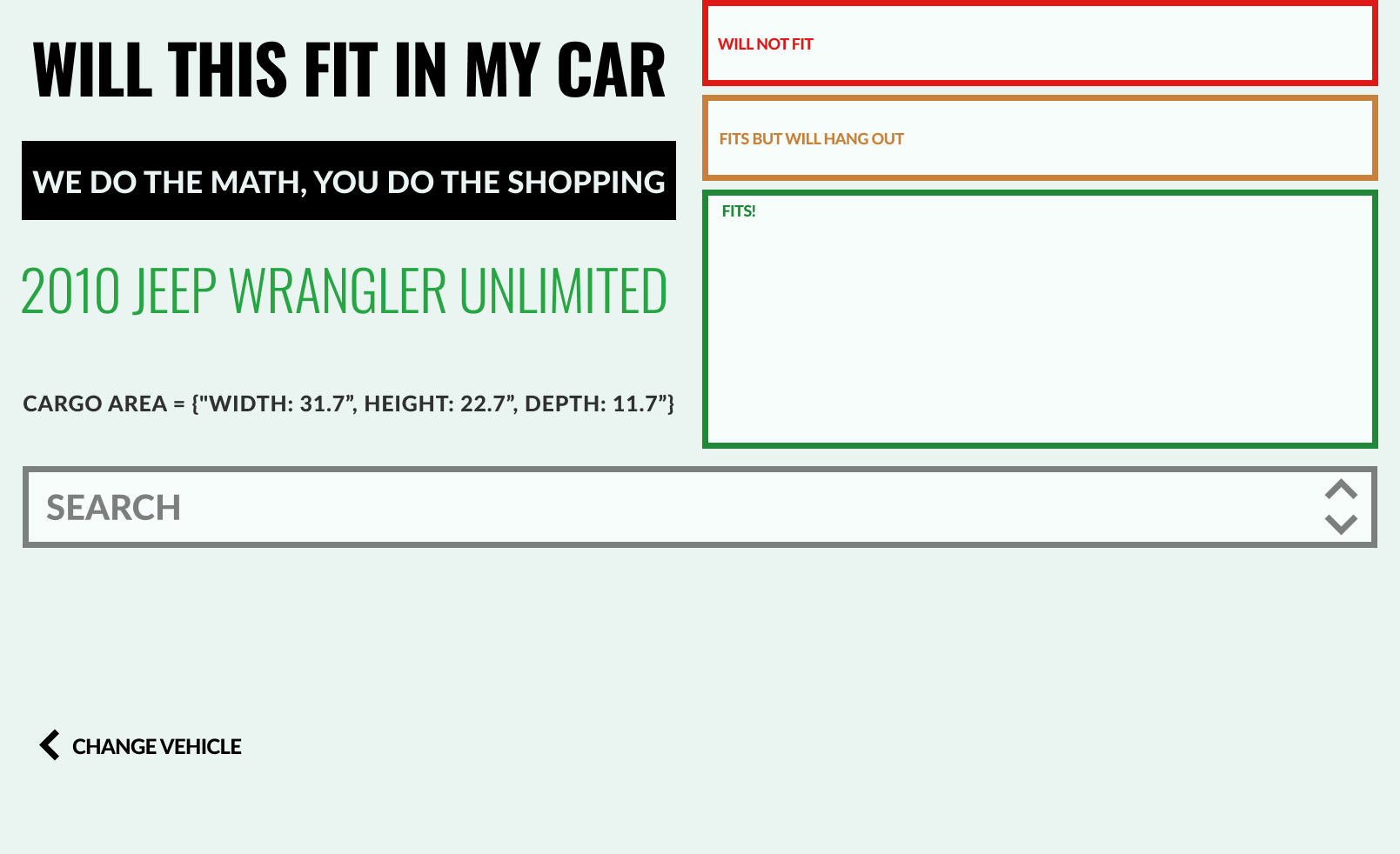
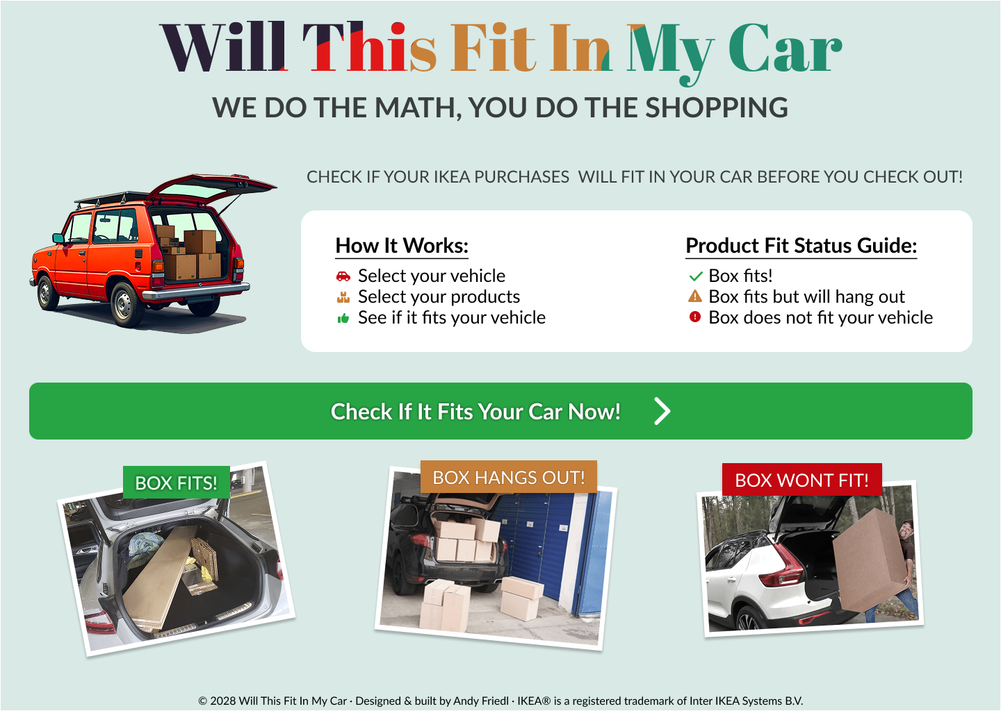
• Items fall into one of three states: Fits, Partial Fit, or Won’t Fit
• Users can remove items, and remaining cargo space auto-updates in real time
• Users select their car make/model to auto-load cargo space dimensions
• Furniture is added by searching name or product number, dimensions auto-fill from known items
• Each item is virtually placed into the vehicle layout, gradually filling the space
• Items fall into one of three states: Fits, Partial Fit, or Won’t Fit
• Users can remove items, and remaining cargo space auto-updates in real time
Solution Summary
Will This Fit In My Car? is a concept tool that visualizes how furniture fits in your vehicle’s cargo space using a responsive, mobile-first interface.
Key features:
• Car selection: Users choose make and model to load accurate cargo dimensions
• Smart product search: Lookup by product name or number (e.g., IKEA) auto-fills item dimensions
• Real-time space calculation: Cargo space fills as items are added; status updates with each one
• Fit status: Items are categorized as Fits, Partial Fit, or Won’t Fit
• Interactive editing: Users can delete items, and remaining cargo space auto-adjusts
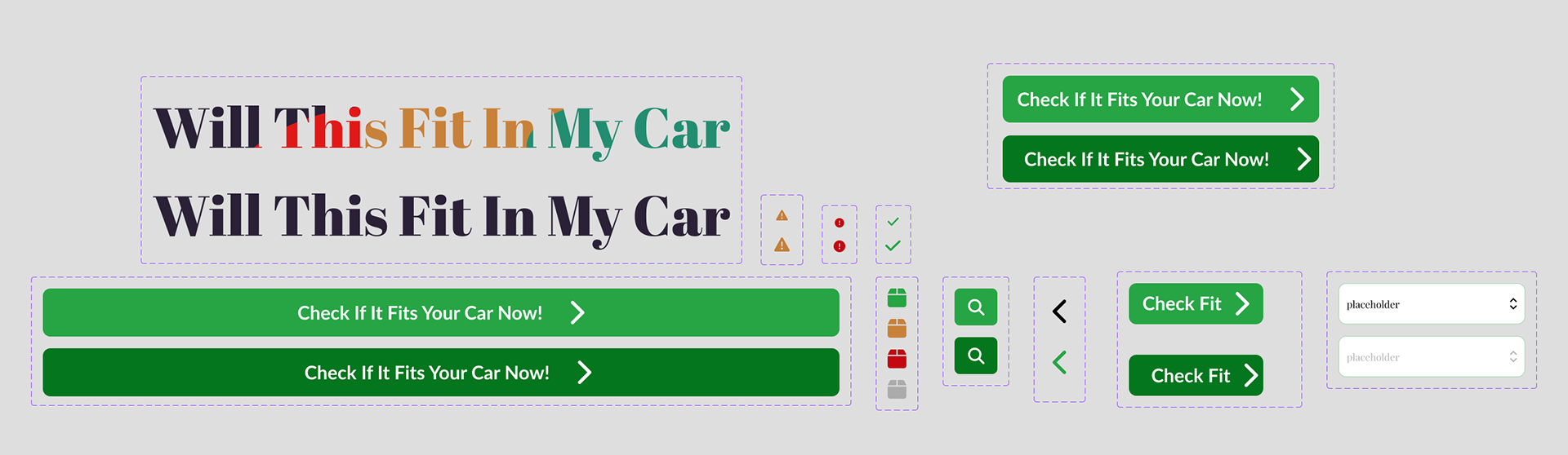
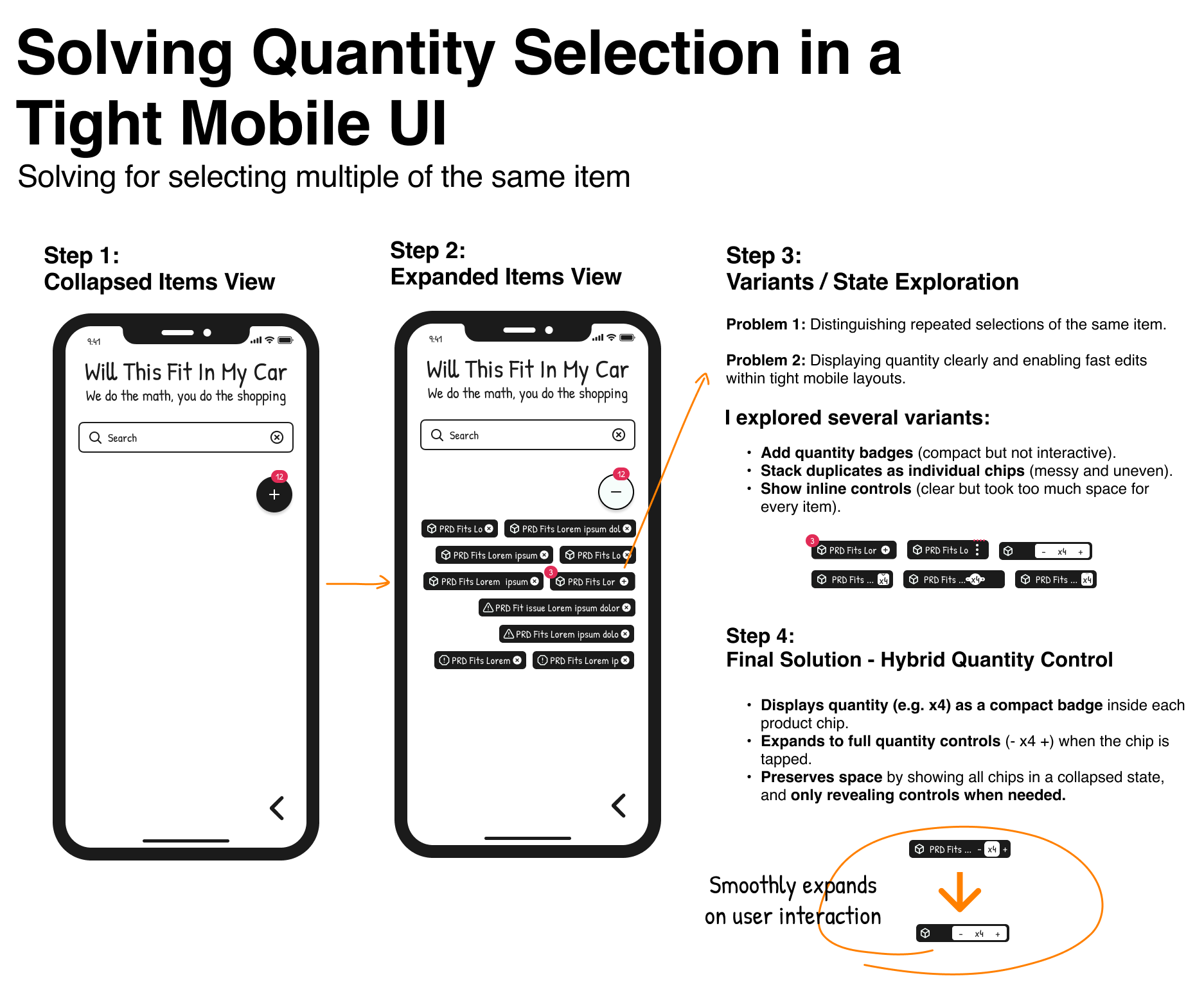
UX Design Considerations
• Brutalist UI style: flat layout, bold type, minimal styling for maximum clarity
• Mobile-first layout with responsive scaling for small screens
• Contrast-heavy visuals for dimensional clarity and accessibility
• Fit status uses plain language (“Fits,” “Partial Fit,” “Won’t Fit”) instead of percentages or charts
• Cargo space visualization updates in real time as items are added/removed
• Intentional avoidance of busy 3D models — focused on clear top-down 2D views
• Debug tools for simulating different fit states and testing Pro/free tiers
Challenges + Tradeoffs
Challenge → Solution
• Limited cargo space data available across vehicle models
⸰ Explored manual input and community sourcing as short-term fallback
• Real-world fit depends on more than just dimensions (e.g., angles, packaging)
⸰ Defined simplified “fit states” instead of promising binary accuracy
• Stacking logic is complex and difficult to prototype
⸰ Deferred to future version; focused on single-layer layout with manual editing
• 3D visualization added complexity without much clarity
⸰ Chose clean, 2D overhead views to keep UX understandable and lightweight
• Lack of API access to product dimensions (e.g., IKEA catalog)
⸰ Relied on manual entry during early prototyping
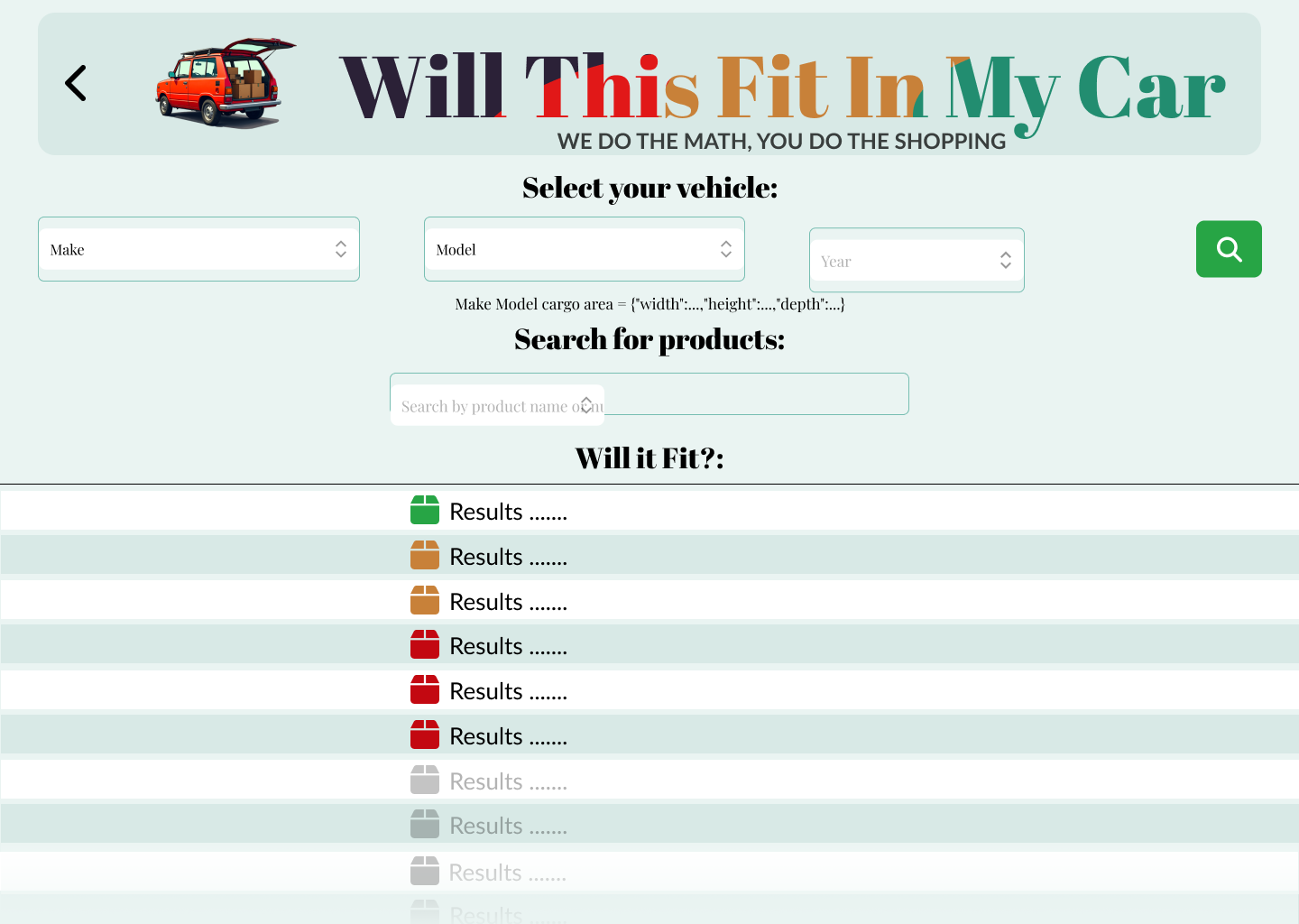
Screens & Flow
I chose a clean, brutalist aesthetic for this app to emphasize its straightforward functionality and provide a bold, user-friendly experience.
This design update (4/25) applies a Brutalist style, but I recognize that the current display of search results and selected products could be more engaging. I'm exploring technologies like 3JS to create a more dynamic user experience in future versions.
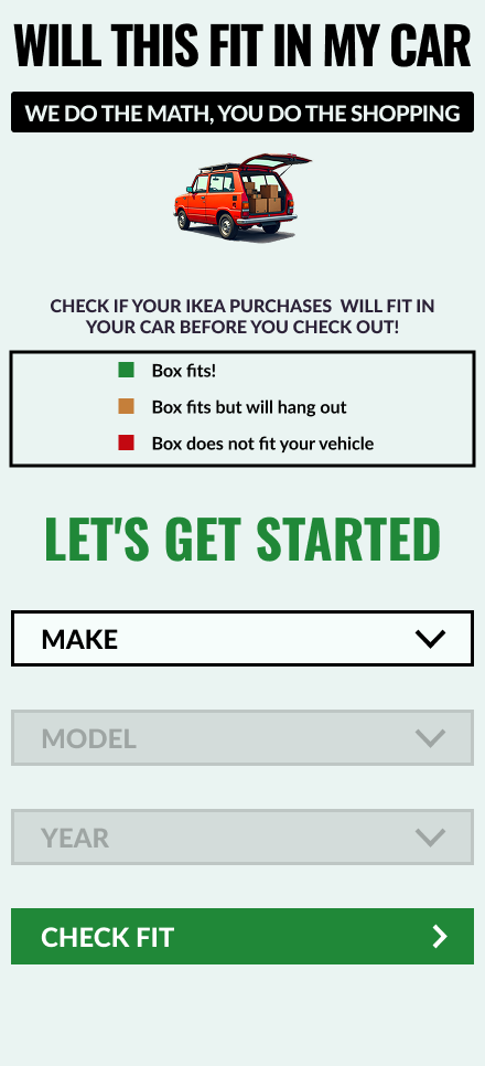
Mobile vehicle selection page

Mobile search with results minimized but requires further refinement.
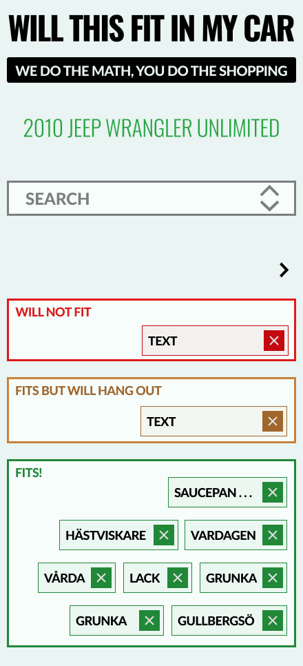
Mobile adaptation maintains readability, but the product search overlay requires further refinement.
What I Learned
Key takeaways from designing and exploring Will This Fit In My Car?:
• Product ideas can stall not from design, but from data availability
• Simplicity in UX often hides deep complexity in logic and sourcing
• Brutalist UI works best when paired with clear, utility-driven purpose
• Not every problem needs to be solved algorithmically, some may be community-driven
• Knowing when to pause is as important as knowing when to build
How it Started and Early Prototypes

Final Version
All that work to land on a simple design that is easier to read.
Initial one-page app concept. The layout proved cumbersome and there is no need for one page.
I tried developing a one page multi-step desktop flow but again this was confusing to users.
The stacked one page mobile layout was not bad.
First iteration of multi page layout. This was the splash/Welcome screen. It proved to be not needed.
This was the vehicle selection page with some placeholder images that did not fit the design.
The search results page for this iteration did not seem to define the steps clearly. Also, the search results covered selected results.